How a masjid finder became a community app built around the masjid: the problems we found, the decisions we made and why, told with the app's own screens and parts.
Tafsir evening: Surah Al-Kahf7:30 pm · Masjid Al-Noor · 300 m
NOV8
Saturday Quran class for kids10:00 am · Jama Masjid · 600 m
Help nearby
Janazah servicesFree clinicFood bank
HomeMapCommunityYou
00 · Overview
First Saff began on 5 October 2026 as Masjid Finder: find the nearest masjid and its prayer times. Within a month it had a new name and a wider idea.
It is now a community app built around the masjid. Prayer times and the map are where it starts. Around each masjid live its classes and events, help nearby such as janazah services and food banks, questions, calls for volunteers, fundraiser notices and the people who run it, all kept right by the people who pray there.
268K+masjids on the map, in 159 countries
4tabs: Home, Map, Community and You
134hand-drawn glyphs in one two-tone style
0ads, trackers or paid tiers
01 · The problem
Where do I pray, and when? Harder than it should be.
Finding a masjid nearby and the right jamaah time today still means a forwarded picture, a paper notice on the wall, or a pin on a map with the wrong details, or none at all.
Forwarded many times9:14
Which masjid is this for?9:20
Forwarded timetablesA photo of a printed sheet, passed on until nobody is sure which masjid or which month it is for.
Prayer timetable
Jumu'ah 1:30
Paper on the noticeboardUsually right, but only if you are already standing in front of it.
MasjidNo timesNo photosNo facilities
A pin called "Masjid"On the big maps, many masjids have a generic name, no hours and no photos. Some are in the wrong place.
The bigger gap
A masjid is a community, but its life is invisible online
The Saturday class, the janazah that needs hands, the food bank in the basement, the roof fund. They live on WhatsApp groups and paper, so you only hear about them if you already know someone.
Saturday classJanazah helpFood bankCommunity iftarSisters' circleVolunteers neededFree clinicRoof repair fundYouth circleOnly if you know someone
How might we
help someone reach the nearest jamaah they can still make, and see the life around each masjid, when most of the information doesn't exist yet?
02 · What the data said
268,703 masjids on the map. Very little to trust.
We started from open map data and imported 268,703 masjids. An audit on 11 October 2026 showed how thin the details are once you look past the pin.
A generic name, like "Masjid" or "Mosque"about 46%
Confirmed iqamah timesalmost none
Photosalmost none
Facilities, like a sisters' spacealmost none
9:41
Generic nameEstimated, not confirmed
Seen in our own test area
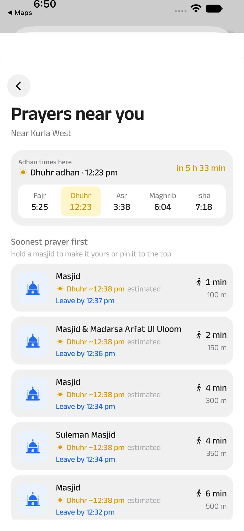
Three of the five nearest were simply called "Masjid"
And none of them had a confirmed time. A list that looks complete would have been a lie, so the app says what it knows and what it doesn't.
Say what's estimatedTimes worked out from the adhan are marked "estimated" until someone who prays there confirms them.
Say when it was checkedA masjid's times show when they were last checked.
Make confirming one tapAnything not confirmed yet carries a strip with "Confirm" and "Not right".
Not confirmed yetDhuhr iqamah 12:38 pm, added by someone nearbyConfirmNot right
The decision the audit forced: the app can't just show data, it has to help people make it right. That is why it is built around the community confirming things.
03 · Who we design for
Six people we keep in the room
Not research participants and not made-up quotes: the people we picture whenever a decision is close, what each of them needs, and what we built for them.
The regular
Prays at the same masjid most days.
NeedsThe exact iqamah, not just the adhanTo hear when the timetable changesWhat's on this week
So we builtMy masjid on HomeReminders before adhan or iqamahJumu'ah times and khutbah language
The traveller
In a city they don't know, with a prayer coming up.
NeedsThe nearest jamaah they can still makeDirections in their own maps appSomething that works on poor signal
So we builtPrayers near you, with "leave by"Google Maps, Apple Maps or WazeOffline area and travel mode
A sister looking for a space
Wants to know before she sets out.
NeedsIs there a women's prayer space?Wudu, and room at Jumu'ahCircles and classes for sisters
So we builtA sisters filter on the mapFacilities confirmed with a tick or a crossSisters' events nearby
The committee member
Keeps the noticeboard and the group chat going.
NeedsTo update times in a minuteTo reach people outside the groupTo show the page is really theirs
So we builtClaim the masjid, with a roleA timetable copied from the noticeboardEvents and fundraiser notices
The organiser
Runs a youth circle, a class or an iftar.
NeedsTo know who's comingTo remind them on the dayTo show what happened
So we builtOrganisations with rolesRSVPs, approvals and ticketsRecaps with photos
The newcomer or revert
New to the area, or new to the faith.
NeedsPlain words, no jargonA calm first few minutesClasses and people nearby
So we built"Prayer" for "iqamah" on everyday screensNo tips on the first openingClasses and circles near you
04 · Principles
Nine rules we design by
Written down early and checked on every screen. The language borrows the craft of Yandex Maps, studied from 91 current screenshots, but not its brand.
12:38
01
The map is the canvas
A full-screen map with a small white sheet: search, filter chips and the next prayer. Everything else is one swipe away.
Directions
CancelOpen now
ActAlsoNeutralSelected
02
Blue means act
One blue button per screen. Secondary actions are tinted, neutral ones grey, selected chips near-black.
Aa400 reading
Aa500 labels
Aa600 titles
Aa700
03
Middle weights only
Anek Latin 400 for reading, 500 for labels and numbers, 600 only for titles. Nothing lighter, nothing heavier.
04
Flat glyphs, two tones
Hand-drawn on a 24-unit grid. The second tone is the same colour at 38%, so one colour gives depth. No 3D art.
IqamahPrayer
FacilitiesPrayers near youHelp & services
05
Fewer words
One-word labels, short titles, no explaining paragraphs. A grey second line only when it adds a fact.
Masjid Al-NoorMasjid · Sunni★ 4.8Open4 minSistersWuduParking
06
Dense, efficient layout
Name, a grey category line, rating, open status and walk time on one line, then chips. Sections split by an 8 pt band.
iOS678
Android7
07
Native where it matters
Platform switches and date pickers, a chevron or an arrow for back, blur on iOS and a solid bar on Android.
Prayer times
Prayer times
08
No gradients over content
Screens open with a large title on a clear bar. As it scrolls away, the bar gains a surface, a hairline and a small title.
Kurla West
09
Map controls
A white pill for the area, white circles and rounded squares for tools. Pins are blue discs; the chosen one is a teardrop.
05 · Information architecture
Four tabs, one question each
The app started map-first. In the fourth round it became prayer-first: Home answers what's next, the Map answers where, Community shows what's happening, and You keeps what's yours.
First Saff
HomeWhat's next?
Next prayer and countdown
Nearest jamaahPrayers near you
Stories: ayah, hadith, adhkar, classes
Hijri date and weather
Ramadan, travel and Jumu'ah cards
Arrange Home
MapWhere?
Search and filter chips
The map sheet
Masjid page
TimetableFacilitiesEventsFundraisersPhotosReviewsImam and staffHistory
Add a missing masjid
Offline area
CommunityWhat's happening?
EventsClasses, talks, iftars
RequestsQuestions and volunteers
Help & servicesJanazah, clinics, food banks
Nearby alerts
The + menuCreate an event, ask for help, add a service
YouWhat's yours?
Profile, points and level
My masjid, saved, reminders
Prayer times, Qibla, Hijri calendar
ConnectionsQuran, hadith, duas
Your events, posts and organisations
Settings
HomeMapCommunityYou
Decision
Prayer first, map second. Round four put the next prayer and the nearest jamaah on the first screen and gave the map a tab of its own, so the map is one tap away instead of being the whole app.
06 · Key flows
Six journeys, start to finish
Each flow is the shortest honest path from a need to an answer, with the real screens along the way.
Tafsir evening: Surah Al-Kahf7:30 pm · Masjid Al-Noor · 300 m
NOV8
Saturday Quran class for kids10:00 am · Jama Masjid · 600 m
Help nearby
Janazah servicesFree clinicFood bank
HomeMapCommunityYou
Next prayer, nearest jamaahThe countdown and the masjid you can still make, with its iqamah and the walk.
9:41
Prayers near youRanked by the jamaah you can still make, each with when to leave.
9:41
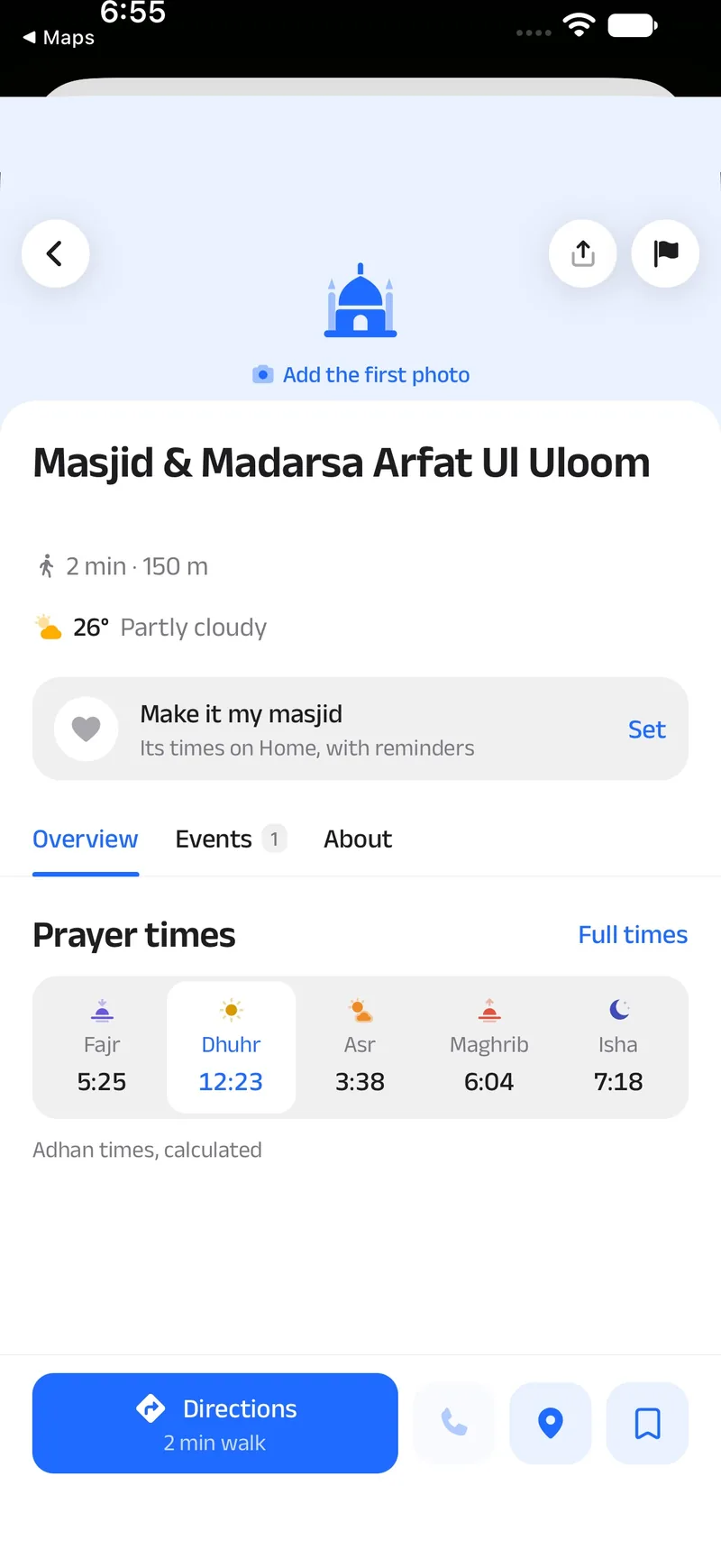
The masjidTimes, facilities and events, with Directions as the one blue button.
9:41
DirectionsWalkDriveTransit
Google Maps
Apple Maps
Waze
Start · 4 min walk
Out the doorThe maps app you prefer, walking when it's under 1 km, and to the gate, not just the middle of the building.
Decision
Sort by the jamaah you can still make, not by distance. Each masjid's next jamaah, from its timetable or estimated from the adhan, plus the walk or the drive. The closest masjid isn't always the one you'll make in time.
B
The trust model
With so little to start from, the people who pray there have to keep things right, and the app has to make that safe.
Anyone suggestsA time, a facility, a missing masjid. Most things go live at once, marked until confirmed.
Others nearby confirmA tap on Confirm or Not right. Masjids that claim their page confirm their own times.
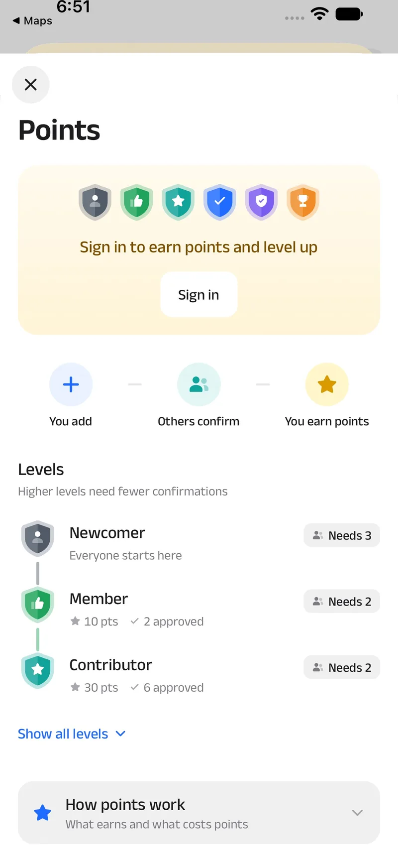
Points and levelsApproved help earns points. Higher levels need fewer confirmations.
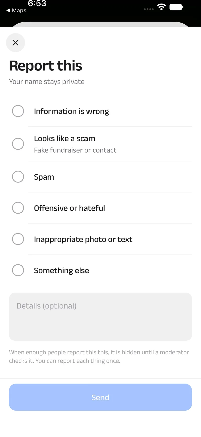
History and reportsEvery change keeps a history, and anything can be reported.
9:41
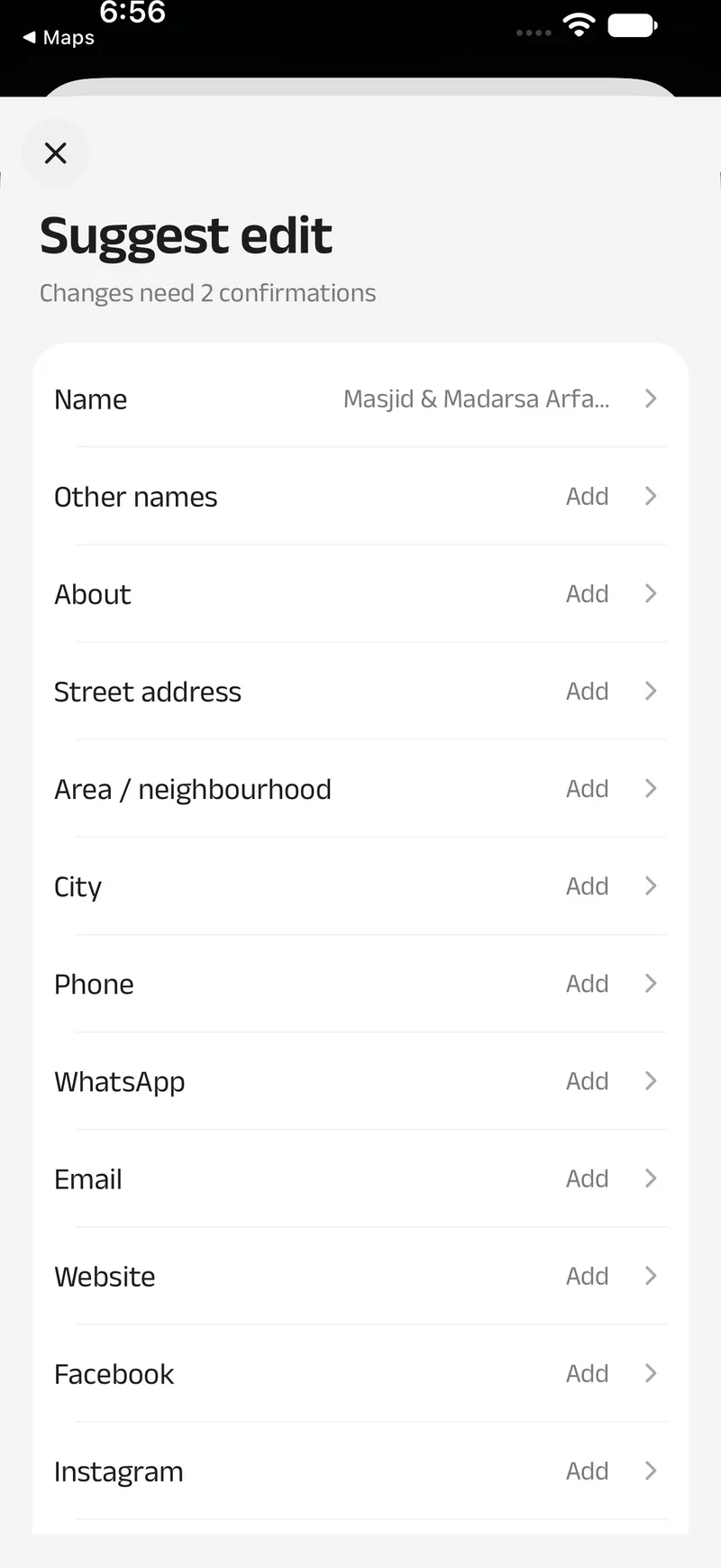
Suggest an edit"Changes need 2 confirmations" sits right under the title.
9:41
PointsYou add, others confirm, you earn points.
9:41
Report thisSix plain reasons. Enough reports hide it until a moderator checks.
Six levelsConfirmations an edit needs, at each level
Newcomer0 pts
Member10 pts
Contributor30 pts
Trusted80 pts
Senior200 pts
Steward500 ptsLive at once
Points alone don't lift you. Each level also needs that many of your additions approved by others.+10new masjid approved+4timetable approved−3rejected−1vote against the outcome
C
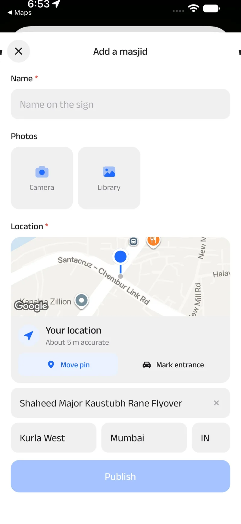
A missing masjid, added in a minute
When a masjid is missing, adding it should take a minute, not an afternoon, and never a duplicate.
Stand in itThe common case: a fresh, precise fix from your phone becomes the pin.
Paste a maps linkA Google or Apple Maps link, or plain coordinates, places the pin for you.
Use a photo's locationPick a photo taken there. If it was taken far away, the app asks "Same masjid?"
Drop a pinMove the map under the pin, with satellite view, and mark the entrance for cars.
Address filled in for youAlready listed within 50 m? It shows you firstPhotos upload while you type
9:41
D
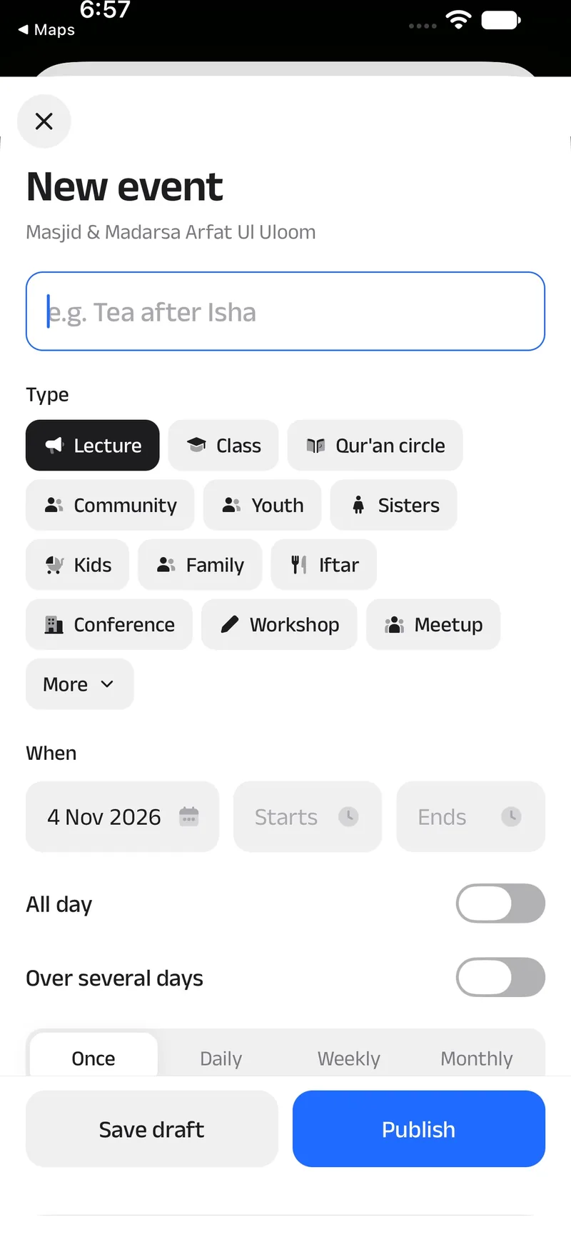
An event, from the first post to the recap
Classes, talks and iftars are a big part of a masjid's life. An event should be easy to post and hard to miss.
1Create
2Remind and RSVP
3Tickets at the door
4Recap
9:41
CreateTwelve types, from a Qur'an circle to an iftar, repeating daily, weekly or monthly.
9:41
LectureOfficial
Tafsir evening: Surah Al-Kahf
Thursday 6 November · 7:30 – 9:00 pm
A weekly reading of Surah Al-Kahf with tafsir in English and Urdu. Tea after Isha. Sisters' section upstairs.
Remind me
Route
Share
24 going8 interested
Masjid Al-Noor300 m · 4 min walk
Kurla Youth CircleOrganiser
Follow
Imam Abdul HameedSpeaker
I'm going
Interested
Remind and RSVP"I'm going" is the blue button; Remind me, Route and Share sit above.
Masjid Al-NoorApproved
Tafsir evening
DateThu 6 Nov
Time7:30 pm
Tickets1 + guest
Show this at the door
Tickets at the doorA check-in helper scans it. Walk-ins can be added there too.
Masjid Al-NoorRecap · Tafsir evening
JazakAllahu khairan to everyone who came. Next Thursday we carry on with Surah Al-Kahf.
42 came3 photos
RecapOrganisers are nudged to add photos and a few lines once it ends. Past events stay on the masjid's page.
Decision
Joining can need approval. Some events need more than a headcount, so organisers can ask sign-up questions, approve requests, allow +1s and let guests sign up on the web without an account.
E
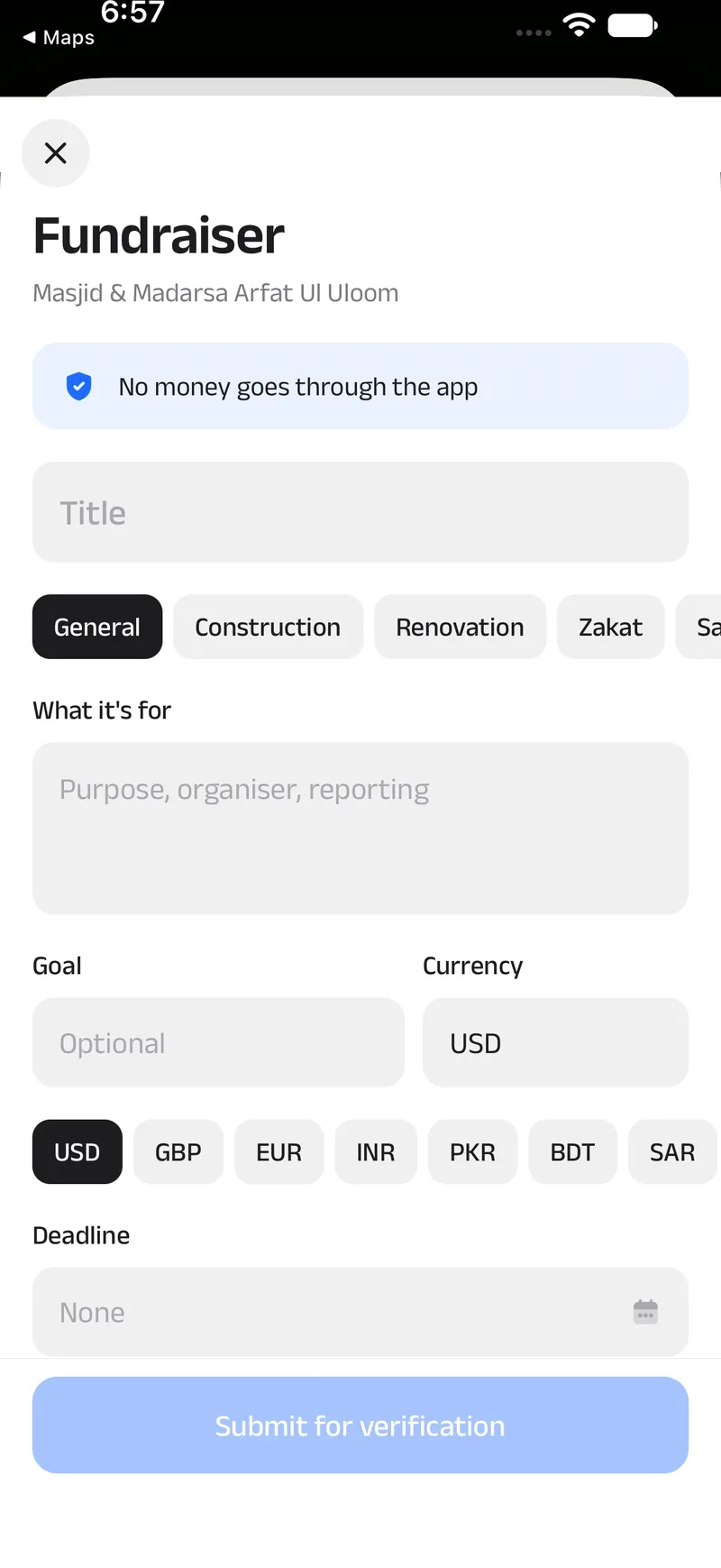
Fundraisers, without money passing through the app
Masjids raise money all the time: a roof, a wudu area, Ramadan food packs. The app makes the need visible and leaves the giving to the masjid.
9:41
No money goes through the appThe first line of the form, before a single field. Notices only: the app shows the need, and the giving happens directly with the masjid.
Renovation₹64,000 of ₹1,00,000 · Roof repair
Update posted by the masjid · until 31 Dec
Legitimate?
LegitimateSuspicious
Anyone can mark a notice. New fundraisers are sent for verification, and a rejected one costs the poster points.
F
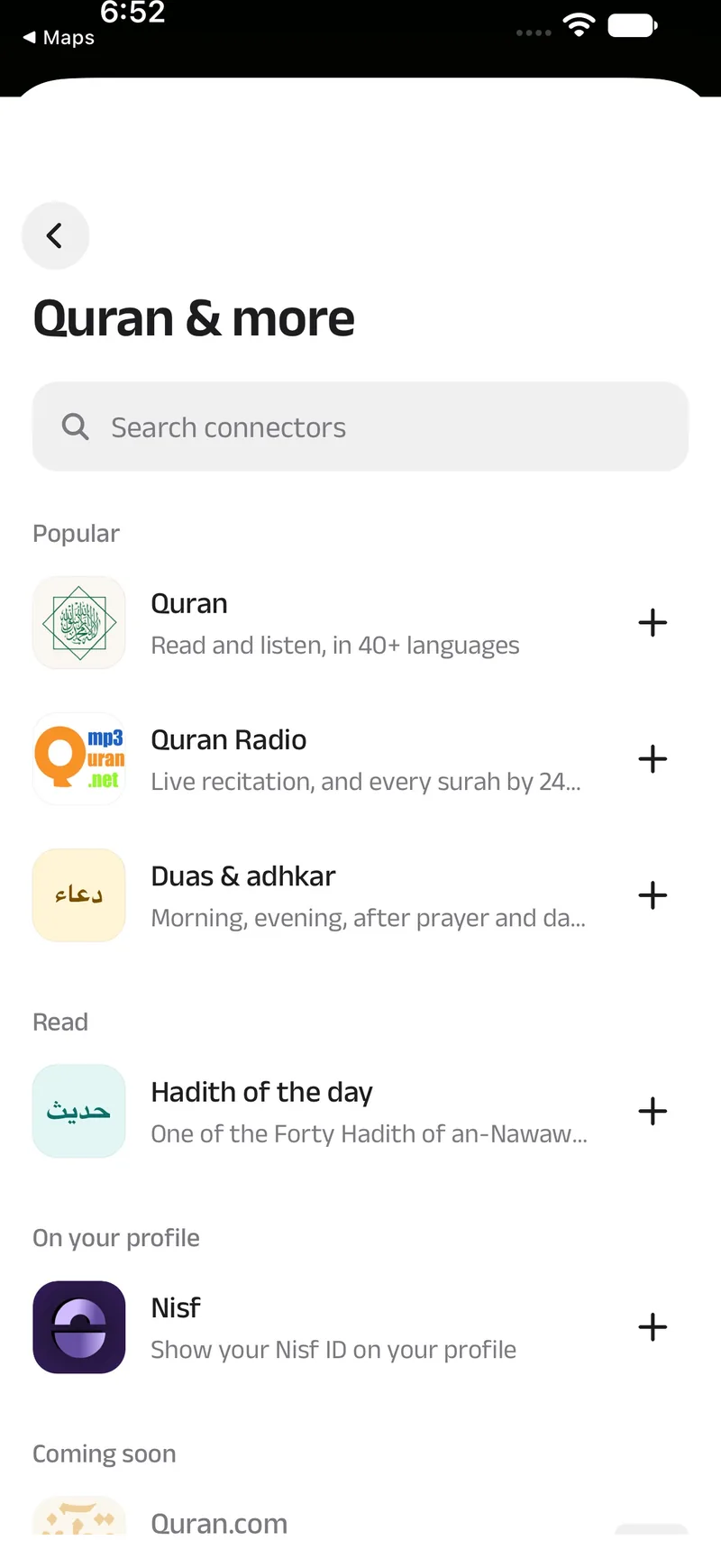
Connections: other people's free services, with credit
Good free Islamic services already exist. Rather than rebuild them, First Saff shows them inside the app, with their makers' names on them.
9:41
Quran & moreEach service connected on its own, by you.
9:41
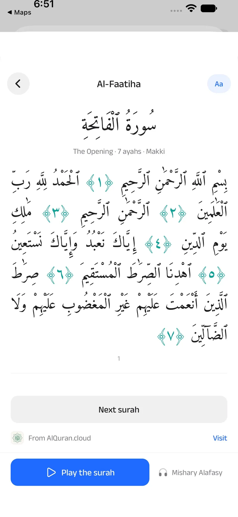
Quran from AlQuran.cloud118 translations in 40+ languages, credited under every surah.
9:41
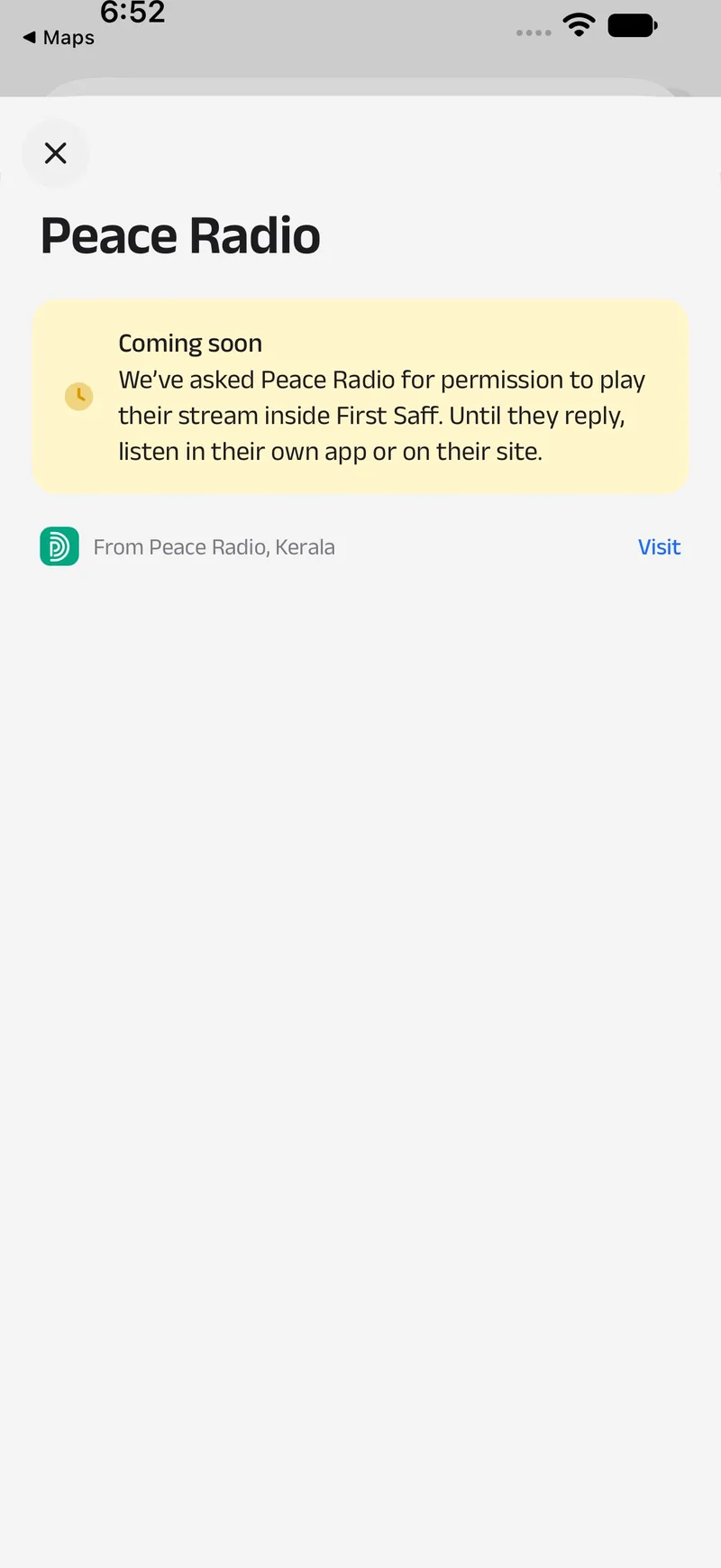
Asked firstPeace Radio and Muslim Central lectures stay off until they agree in writing.
From AlQuran.cloudVisitHadith API · links to Sunnah.comVisit
07 · Design system
A small system, used everywhere
Tokens live in one file, glyphs in another, components in a third. Feature code uses only these, so a change to a token reaches every screen. It is also how dark mode and Larger text work everywhere at once.
Colour
Act
Blue#1F6BFF
Pressed#1859D9
Tinted#EAF1FF
Ink
Ink#1D1D1F
Secondary#7A7A80
Tertiary#A8A8AD
Surface
White#FFFFFF
Backdrop#F4F4F4
Tile#F0F0F0
Hairline#E6E6E6
Signal and honour
Open, verified#1FA35B
Closed#F0453A
Gold#F5B800
Gold ink#7A4F00
Eight glyph tones, each a colour and its soft background, so different kinds of things can be told apart at a glance.
Type
Display30 / 600Prayer times
Title 124 / 600Masjid Al-Noor
Title 220 / 600Happening soon
Title 317 / 500Tafsir evening: Surah Al-Kahf
Body16 / 400A weekly reading with tafsir in English and Urdu.
Subhead14Dhuhr 12:38 · leave by 12:33
Caption12.5Adhan times, calculated
AaAnek Latin 400, 500 and 600. Narrow, open, a little square in its curves.
Corners
22Sheet
20Island
16Tile
14Button
12Field
10Chip
Glyphs
Main tone: the colour itselfSecond tone: the same colour at 38%24-unit grid, softly rounded corners
134 glyphs, drawn for First Saff and shared by the app and this website. One colour gives depth, so a glyph can sit bare in a row, on a tinted square or on a tinted circle and still look like itself.
Components
Button
DirectionsRemind meCancelDelete
Chip
Open nowSistersJumu'ah
Segmented
CalculatedFixed times
Row
Masjid Al-Noor300 m · 4 min walk
Kurla Youth CircleOrganiser
Follow
Toggle and tag
Travel mode
Friday reminders
LectureOfficialConfirmed
Prayer strip
Fajr5:25
Dhuhr12:23
Asr3:38
Maghrib6:04
Isha7:18
08 · Craft details
Small things, done properly
The details people only notice when they're wrong.
Prayer times
Prayer times
Kurla West · 24 Jumada al-Ula
5:32:45Dhuhr · 12:23 pm
Fajr5:25 am
Sunrise6:40 am
Dhuhr12:23 pm
Asr3:38 pm
Maghrib6:04 pm
Isha7:18 pm
Collapsing title
A large title that hands over to the bar
Pushed screens start with a clear bar and a large title. As the title scrolls under, the bar gains a blurred surface on iOS or a solid one on Android, a hairline, and a small centred title.
Resting
Place card
Full page
Map sheet
Three resting points
Small at rest, a place card halfway, and at the top a full masjid page with a back bar, without leaving the map.
FacilitiesWomen's prayer hallWudu area
Imam and staffAbdul HameedImam
8 pt band
A grey band, not another card
Sections on a page are split by an 8 pt band of backdrop grey, which keeps long pages calm without boxing everything in.
iOSAndroid
BackChevronArrow
Bar when scrolledBlurSolid
Date and timeWheel sheetMaterial dialog
SwitchesPlatform switchPlatform switch
SpacingAs drawnAbout 8% roomier
Letter spacingTightened titlesNone, so the last letter isn't clipped
Native bits
One design, two platforms
The same screens on both, with each phone's own controls where people expect them.
Blue
Tinted
Base
Card
Ink
Green
Masjid Al-NoorDhuhr 12:38 · leave by 12:33
Go
Masjid Al-NoorDhuhr 12:38 · leave by 12:33
Go
Dark mode
Every token has a dark twin
Accents are lifted a little so they keep contrast on dark surfaces, and soft tints become deep, low-saturation versions of themselves. Settings offers Device, Light or Dark, and Larger text, which makes the whole type scale 15% bigger.
Where are you?To show masjids and prayer times near you.
Use my locationChoose a place
Permissions
Ask at the moment it matters
Location is never asked for on opening: a card says why and offers a choice. Notifications wait until you set a reminder.
Sheetdamping 30 · stiffness 260
Pressdamping 28 · stiffness 480
Popdamping 22 · stiffness 240
Motion
Three springs, named once
Presses, tabs swiping back into place and the segmented control share three springs set in the theme, so motion is decided once, not screen by screen.
Pull to refresh
The whole screen becomes the card
Pull down and the screen itself slides away as one card with rounded top corners, uncovering a blue band that runs right up under the status bar. The arrow turns with your finger, the label changes from "Pull to refresh" to "Release to refresh" past the threshold, then it spins while the data loads, says "Updated" and springs back.
Rubber band0.8 of your drag at first, firmer as it goes
At least 0.6 sso a fast refresh never flashes
iOS bounce keptAndroid gets a pan that only starts at the top
9:41
Pull to refreshRelease to refreshRefreshing…Updated
Women's prayer space near the station?3 answers · 150 m
HomeMapCommunityYou
09 · Iterations
Round by round, in the open
Most rounds were saved as a checkpoint before the next began. This is what changed each time, as the changes themselves record it.
v1v2v3v4v5First Saff
1 Novv1-maplibre
Masjid Finder, the first build
One Expo codebase for iOS, Android and the web, a Supabase database with its rules, photo uploads, and a design system. A map home on MapLibre; masjid pages with timetables, facilities by vote, photos, reviews, people, events and fundraisers; Qibla, weather, and profiles with scoring and a moderation queue.
The first look borrowed from Yandex Go: yellow, 3D emoji, heavy type. It was later replaced by the quieter craft of Yandex Maps, which is the language you see today.
2 Novv2-google-maps
Google Maps, and the masjid inside the sheet
Google Maps on phones, MapLibre on the web. The masjid page moved into the map sheet, whose top resting point became a full page with a back bar. Adding a masjid was reworked: photos upload as you pick them, place search, an entrance pin for cars, Jumu'ah time and language.
2 Novv3-map-first
Map-first
Map layers and walking rings, search results on the map, community boards, nearby alerts, and worship tools: a fasting tracker, Friday and suhoor and iftar reminders, travel mode. New kinds of place too: prayer rooms, Eid grounds and temporary jamaats.
2 Novv4-tabs
Prayer-first, in four tabs
Today, Map, Community and You. Today ranks nearby masjids by the jamaah you can still make, from the timetable or estimated from the adhan plus the walk or drive, with Jumu'ah on Fridays. Green pins mark masjids with confirmed times. Today is called Home now.
MapTodayMapCommunityYou
3 Novv5-community
The community round
Joining events with approval, sign-up questions, +1s and walk-ins; organisations with verification and followers; and confirmation rules: most things go live at once, labelled until confirmed, while pushes and alerts wait for one confirmation.
3 Nov
Connections
Free Islamic services inside the app with their makers' logos and credit: the Quran from AlQuran.cloud, Quran Radio, duas and adhkar, a hadith of the day. Peace Radio and lectures were built, then kept off until their makers agree.
3 Nov
A calmer, plainer app for new users
No tips on the first opening, then at most one a day. Location never asked for on opening. "Prayer" instead of "iqamah" on everyday screens. Home's seasonal cards one at a time, friendly load errors, Larger text, and no hidden long-presses. Row titles and chips moved from Regular to Medium.
3 Nov
Renamed First Saff
The app became First Saff everywhere people see it, at firstsaff.com. It wasn't in either store yet, so this was the last cheap moment to change its name and its ids.
3 Nov
Faster, closer to home
The database moved to Mumbai and each screen's reads were batched into one request. Measured from Kerala, one database call went from 0.54 to 1.8 seconds down to 0.16, and the profile page from 4.9 seconds to 0.08.
3 Nov
A new mark
The mihrab mark across app icons, the launch screen, store art and a brand study. The launch screen became brand blue edge to edge, with the mark alone in the middle.
3 Nov
Small decisions, written down
The big create buttons under each Community tab went: the + menu at the top already had them.
The map asks for location only on "Use my location", not when the tab opens.
Prayer reminders are scheduled once, not once per launch, after a day of installs left eight identical Isha reminders.
On an iPhone without Google Maps or Waze, directions open Apple Maps rather than a web page.
4 Nov
This website
A first site went up on firstsaff.com on 3 November, with the web app moving to app.firstsaff.com. A day later it was rebuilt in the style of the Glow template, with the app's own colours, type and glyphs, and this case study.
10 · Brand
The first row, drawn
How the mark was made: what the name means, what we studied, what we tried and threw away, and why the final mark looks exactly the way it does.
a mihraba 1the first row
41references studied
7design rounds
~50drawings and variants
10legibility tests
AThe name
صَفّ
saffnoun · a row
The straight line worshippers form in prayer, shoulder to shoulder and foot to foot, facing the qibla. The first saff is the front row, nearest the imam and the mihrab. To be in it, you have to arrive early.
That is the whole idea of the app: know where the nearest masjid is and when the next prayer starts, so you can be there first.
The first saffThe rows behindRows fill from the front.
“If people knew what is in the call to prayer and the first row, and found no way to get it but to draw lots, they would draw lots.”
The Prophet ﷺ · Sahih al-Bukhari 615, Sahih Muslim 437
“Straighten your rows, for straightening the rows is part of establishing the prayer.”
The Prophet ﷺ · Sahih al-Bukhari 723, Sahih Muslim 433
What it meant
The name isn't about a building. Most masjid apps draw one. Ours is about being first, and about the row, so a logo that only says "mosque" would miss the point of the name.
BThe brief, and the gap
Six things the mark had to do, written down before the first sketch and checked against every round.
01Say masjid, without the clichéNo domes, crescents or mosques in pins.
02Say firstThe name is a promise to be early. Carry the number one.
03Show the rowA saff is a line of people. The mark needs a line in it.
04Work at 16 pixelsFavicons, notifications, map pins. If it breaks small, it breaks.
05Feel like the appSaff Blue, soft corners, calm, Anek Latin. Not a brand bolted on.
06Reward a second lookThe best marks hide a second meaning. So should ours.
CrescentDomeMinaretsMosque in a pinGreen and goldOur first icon
The pictures masjid apps keep coming back to, redrawn by us as plain diagrams. Our own first icon was one of them: clean and friendly, but any masjid app could have it.
The gap. Every one of these says "mosque". None of them says first, and none shows a row. That empty space is where our name lives, so that is where the mark should live too.
C41 references, read one by one
We started from a board of logos the team loves. Each one was opened at full size and studied for its shape, its colour, its light and what makes it stick.
1187654
Soft 2.5D app iconsWordmarks and lockupsInterface and moodFlat app iconsSymbol marksTypography and identity
A hidden second readingTakenA pin that is also an arrow, a u that is also a p. The mark you remember rewards a second look.10 of 41
One bold shape, one colourTakenOne clear silhouette on one flat colour. Nothing competes with the hero.22 of 41
Rounded, pill-ended geometryTakenSoft corners and round ends feel friendly without looking childish, and survive being shrunk.12 of 41
Soft 2.5D materialTakenA gradient tile and a raised glyph with light on its top edge: depth without realism.11 of 41
One accent does the talkingTakenA cool base with one warm accent. The eye lands on the accent first, so it should carry the meaning.7 of 41
A face or a characterLeft outCharming for games and food, but a place of prayer is not a cartoon.9 of 41
Counts are our own tally, and a reference can show more than one pattern. The references belong to their designers, so we don't show them here; the small drawings are ours.
DSeven rounds, about fifty drawings
Each round answered one question, and the answer usually threw something away. These are the real working sheets.
Round 1Six first ideas
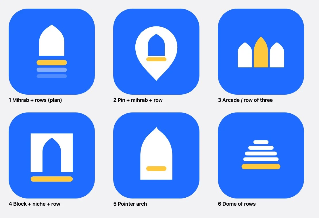
A mihrab with rows, a pin with a mihrab inside, an arcade, a gate, a pointed arch and a dome built from rows.
KeptThe rows, and the mihrab instead of a whole building.
DroppedThe pin with a building inside, which every finder app has.
Round 2The idea that clicked
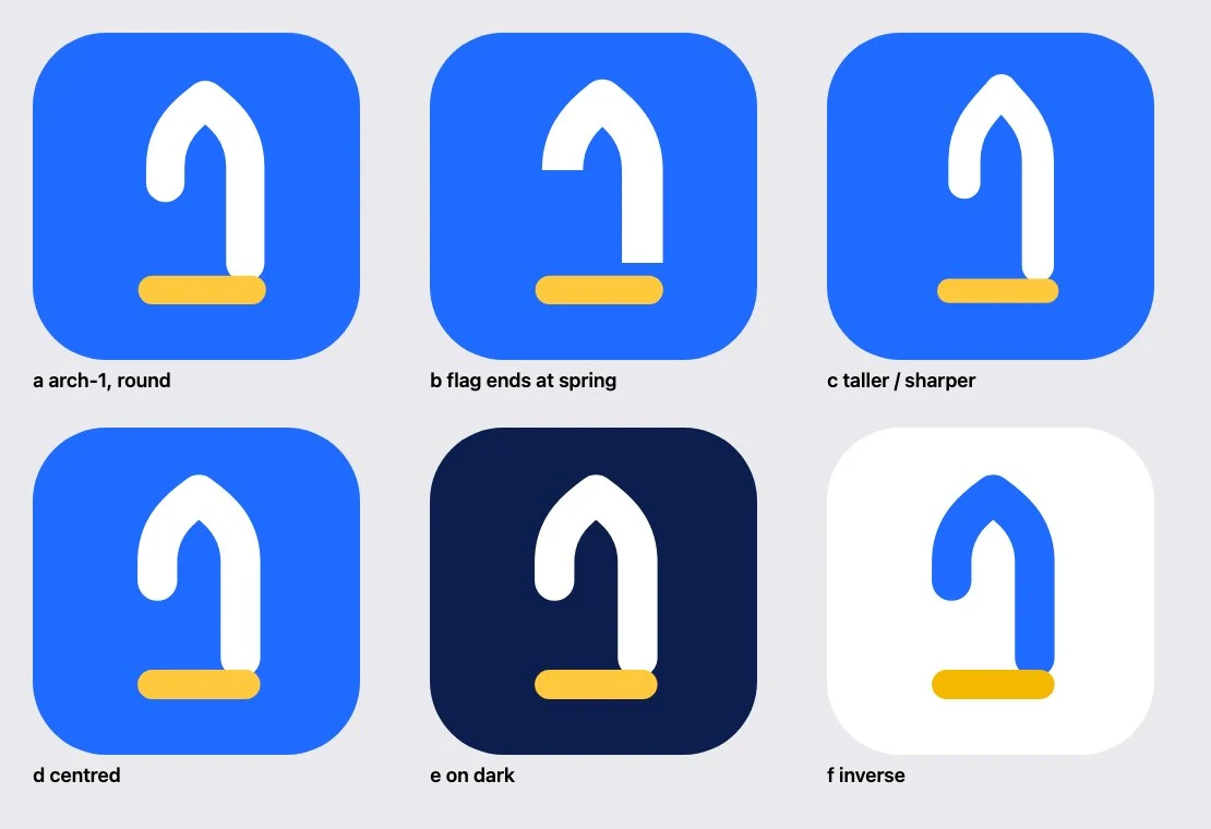
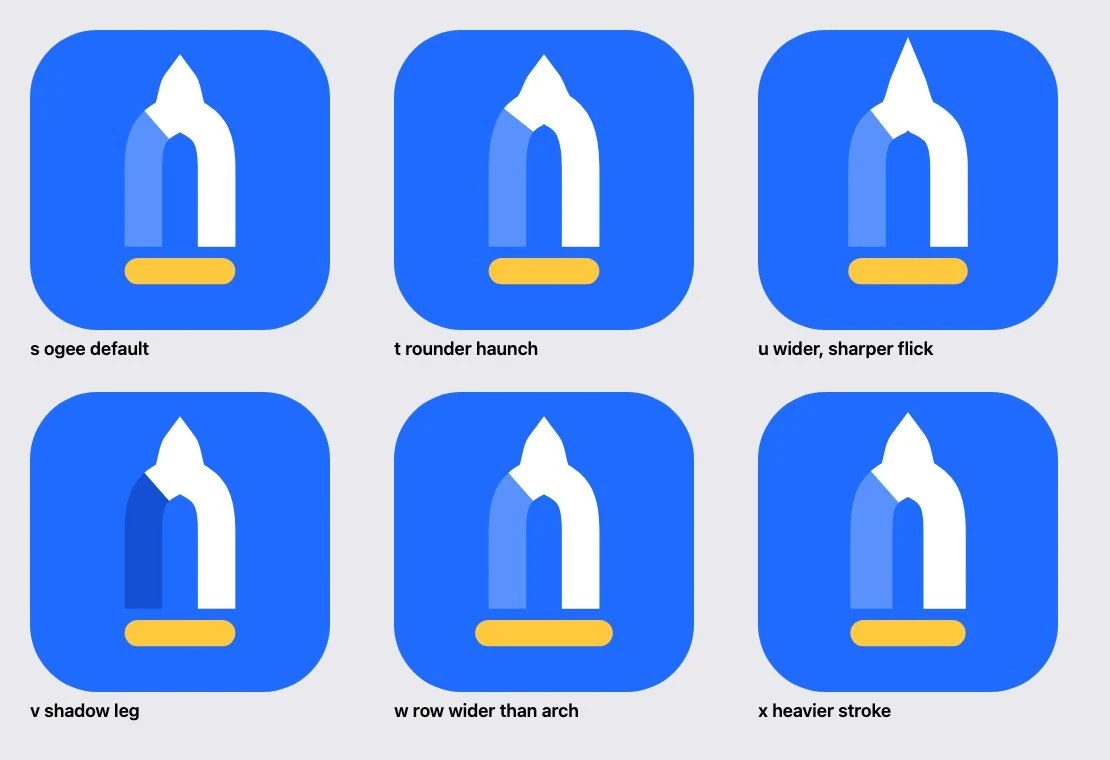
Cut away the lower part of a mihrab's left leg, and what is left could be the number one.
KeptArch, one and row: one shape, three meanings.
DroppedA left end hanging straight down: a hook or a cane, not a 1.
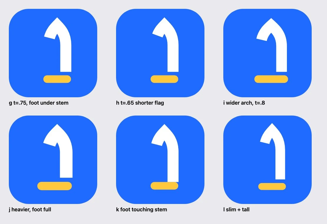
Round 3Making the 1 a 1
Stop the left curve part way down and cut it square to the curve, so the flag points down and left like a real numeral.
KeptA cut square to the curve: a 1 at every size.
DroppedWith half the arch gone, the mihrab disappeared.
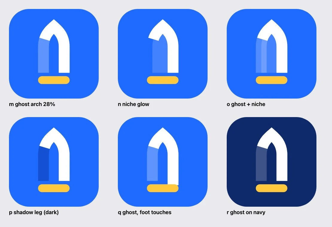
Round 4Bringing the arch back
Draw the missing leg again, but faded. The eye completes the arch and still sees the solid 1 in front of it.
KeptThe ghost leg: both readings at once.
DroppedA bullet-shaped arch that looked like a pen nib.
Round 5Trying a true ogee
A real mihrab has round shoulders that flick into a fine point. We tried it with thick strokes.
KeptThe lesson: draw filled shapes, not thick lines.
DroppedStrokes that kink into spikes at the tip.
Round 6Shapes, not strokes
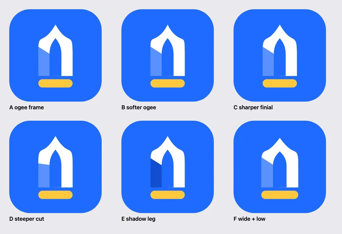
Rebuilt as an ogee outline minus a pointed niche, the way a real frame is made.
KeptUnmistakably a masjid door.
DroppedRound shoulders that read as a small pagoda, and a weaker 1.
Round 7The balance
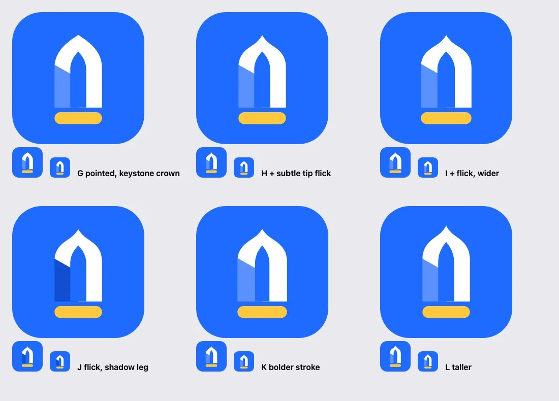
A simple pointed body, with the ogee only in the last tenth of the tip. Every option checked at 60 and 40 pixels.
KeptVariant K: the bolder stroke survives best when small.
DroppedThinner options, which break up below 60 pixels.
MaterialFrom flat to 2.5D
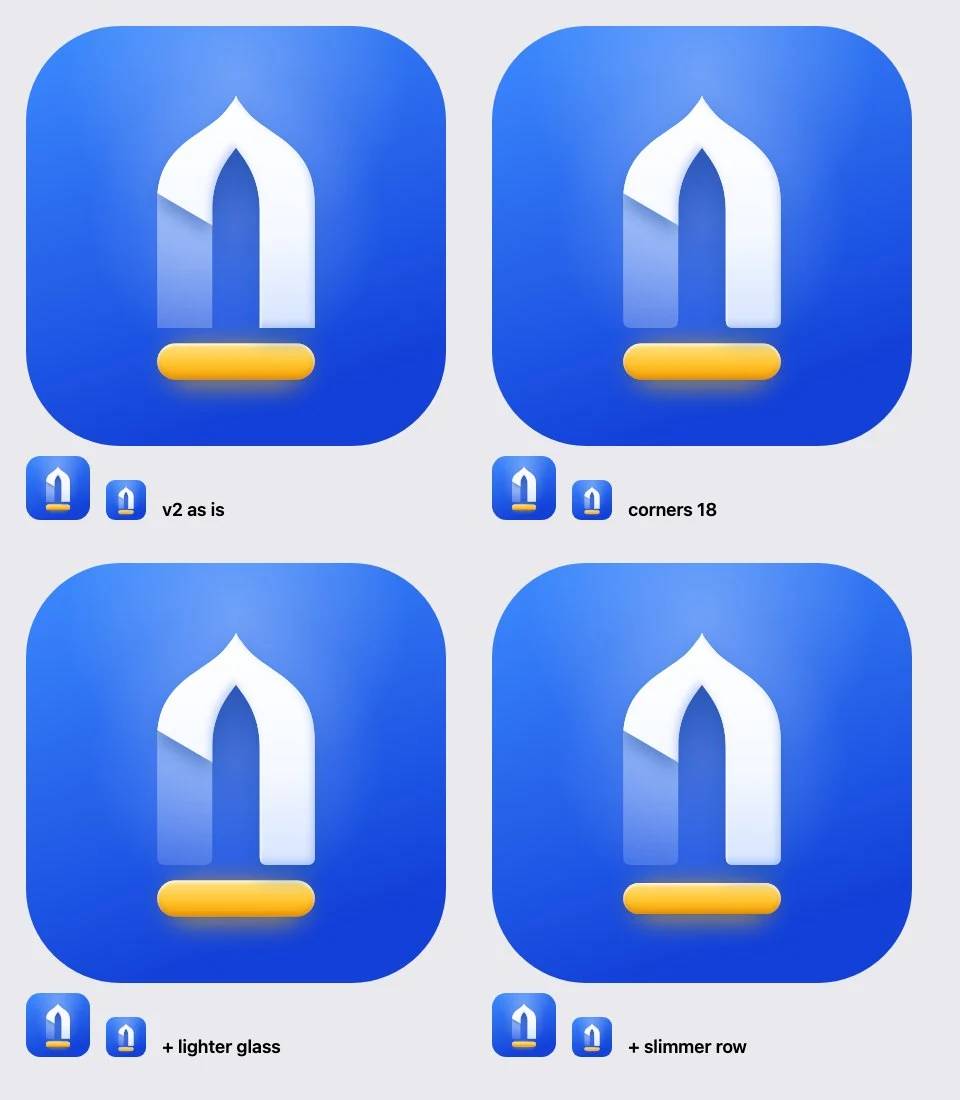
The flat mark became an app icon: a recessed niche, a frosted leg, a raised 1 and a glowing row. Then four refinements side by side.
KeptSoft 18-unit corners, lighter glass so the 1 leads, a slimmer row.
DroppedSquare feet, heavy glass, and a row like a button.
EOne shape, three readings
The mihrabthe niche every masjid faces+The oneits solid half is a 1+The rowthe first saff, in gold=First Saffone mark
Try it
Both at once
At the weight we chose, the arch is complete but the 1 is the brightest thing in it. You see the masjid first, and the number a moment later.
Only the 1Our balanceOnly the arch
MihrabWhy a mihrab, not a dome
The niche in the qibla wall. Every masjid has one, from a village room to a grand mosque, and every row lines up in front of it.
OneWhy hide the 1
A plain "1" would be a number, not a logo. Hidden in the arch, it becomes the moment people remember: "oh, it's a one."
RowWhy gold for the row
In the app, gold already means recognition: levels, the leaderboard, thanks. The first row is an honour, and the one warm thing on a cool tile.
FConstruction and material
Drawn on a 1024-unit canvas with a 64-unit grid, from filled shapes rather than lines, so every edge can be controlled exactly.
Canvas
1024 × 1024 units, 64-unit grid
Arch width
384 units, 37.5% of the canvas
Leg width
134 units, about a third of the arch
Crown depth
126 units, so the stroke feels even
Tip
The last 11% of the rise is a small ogee
Fold
30° below horizontal, square to the curve
Row
384 × 76: as wide as the arch
Gap
44 units between the feet and the row
Corners
18 on the feet; tip and fold stay sharp
Balance
170 above, 168 below: centred within 2
Built as one outline
Outer arch, across the feet and back over the niche in a single closed path. No overlapping edges, so no hairline seams at any size.
Pointed body, ogee tip
A full ogee looked like a pagoda, a plain point like a pen nib. A plain point with a small flick at the very top reads as a masjid.
The fold, square to the curve
A horizontal cut made a hook. A cut at 30°, square to the curve, makes the flag of a numeral, as if the leg were folded back.
TileSaff Blue from a lighter #3D8BFF at the top to Deep Blue at the bottom, with a soft sheen in the top-left corner.
NicheThe inside of the arch darkens towards the top, like a real alcove, so it reads as a recess, not a sticker.
Glass legWhite at 32% fading to 10%, with a crisp highlight on its lit edge. The same idea as the app's two-tone glyphs.
The rowGold from #FFE38A to #F5A300, a bright top edge, and a warm glow that spills onto the tile.
The oneNear-white, a cool shade on its lower-right edges and a rim light on the upper left. Its shadow falls across the fold.
The tip at 2×: smooth shoulders, a fine ogee point, shade along the inner edge.The fold at 2×: the 1 casts its shadow onto the glass, which sells the depth.
When there's no room for light
Below about 29 pixels, and anywhere effects aren't possible, the mark goes flat: same shapes, same two-tone rule, no shading.
GTen tests before we called it done
A logo lives mostly at small sizes, at a glance, on someone else's wallpaper. So we tested it the way people will actually see it.
16favicon24324864home screen96140splash200storeShown at real pixels. 16 px uses the flat version.
The squint test
Blur it until the detail is gone. A strong mark keeps its shape: a tall white arch on a gold line.
SharpSquintingAcross the room
TypicalProtanopiaDeuteranopiaTritanopiaNo colour
Colour vision
About 1 in 12 men and 1 in 200 women see colour differently. The mark is built on lightness, not hue, so the 1 and the row stay clear.
Silhouette
In one colour the shape alone has to carry it. Without the glass leg, it's a pure 1 on a line.
First Saff
First Saff
On real wallpapers
Light and dark, busy and calm: the blue tile and the white 1 stand out on both.
CircleSquircleThemed iconNotification
Android shapes
Android crops the icon to whatever shape the phone uses. The mark sits inside the safe zone, so nothing is ever cut, and it works as a themed icon and a white notification glyph.
Contrast, measuredWCAG ratios from the exact colours. Shapes need 3:1, text needs 4.5:1.
White on Saff Bluethe 1 against the tile4.6:1
Gold on Saff Bluethe flat row against the tile3.1:1
Row in the app iconfrom the icon's own pixels4.6:1
Saff Blue on whitethe tile on a white page4.6:1
White on Nightwordmark on dark17.1:1
Night on Goldtext on a gold surface11.7:1
Caught by this test
The first gold, #FFC23A, measured only 2.8:1 on flat Saff Blue, just under the 3:1 a shape needs. In the 2.5D icon it was fine, because the row sits on the deeper blue at the bottom of the tile. So the flat gold moved to #FFD04F, a touch lighter, which passes everywhere.
Readable from 16 to 1024 px
An arch and a 1 when blurred
Distinct in three kinds of colour blindness
Holds as a one-colour silhouette
The 1 and row pass 3:1, flat and 2.5D
Fits Android's circle and squircle
Works as a themed icon
Reads as a white notification glyph
Stands out on light and dark wallpapers
Centred optically within 2 units
HWordmark and usage
400Regular, for reading
500Medium, for labels and numbers
600SemiBold, for titles
700Bold, only in the wordmark
Bold, at 0 tracking
We compared 600, 700 and 800. 600 looked thin beside the icon, 800 crowded the counters. 700 matches the weight of the arch's legs.
The gold dot
The dot of the i sits exactly where Anek draws it, but in gold. It's the first row again, tying the word to the mark.
Why not Inter
An early version used Inter. It was neat but generic. Anek is already on every screen of the app, so the name looks like it belongs.
On white
On Saff Blue
On Night
One colour
Clear space and minimum size
Keep a quarter of the icon's height clear on every side, and leave the drawing alone.
App icon, 2.5D
29 px and up
App icon, flat
16 px and up
Lockup
110 px wide and up
Backgrounds
White, light grey, Saff Blue, Night
Don't stretch itDon't rotate itDon't recolour the rowDon't fill in the legDon't outline itDon't add a crescentDon't put it on busy imagesFirst SaffDon't change the typeface
IWhere you'll meet it
9:41
LaunchBrand blue edge to edge, the mark alone in the middle.
9:41
3:12
Tuesday 3 November
First Saffnow
Asr in 15 minutes. Leave now for the first row.
NotificationsThe white notification glyph, on a reminder before the prayer.
9:41
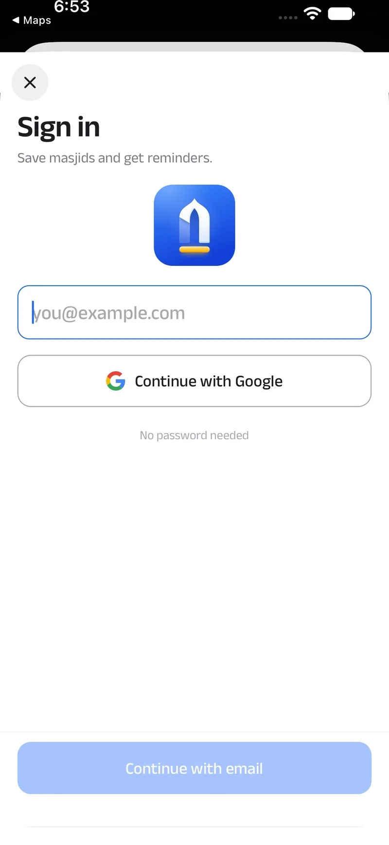
Sign inThe 2.5D icon, at the top of the sign-in sheet.
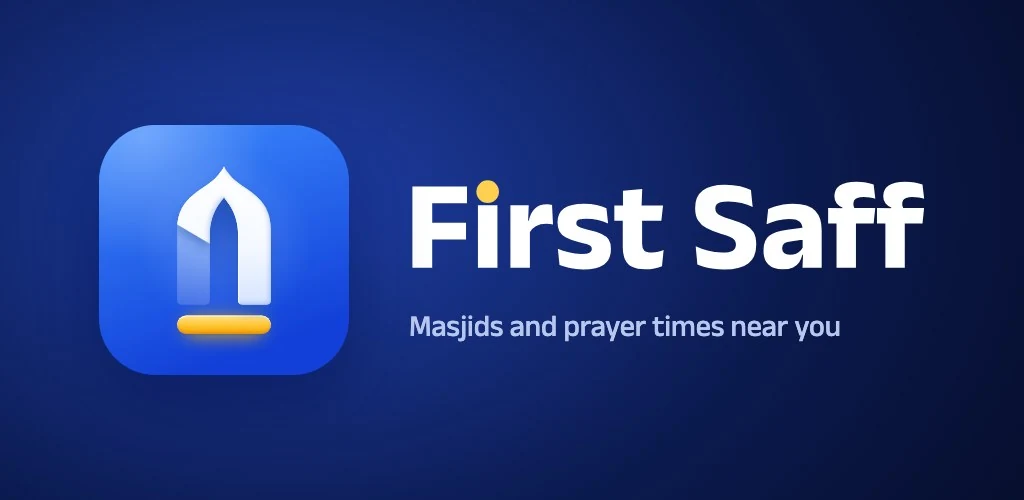
The Google Play feature graphic.
First Safffirstsaff.com
The favicon: the flat mark at 16 pixels in a browser tab.
JBrand assets
The files, for anyone writing about First Saff or putting up a poster at the masjid. Please use them as they are.
Gold works because there is so little of it: the row, the dot, and moments of recognition. Tap a colour to copy it.
11 · Next, and lessons
What's next, and what we learnt
NextPlans and ideas
The iPhone and Android appsIn the App Store and Google Play, insha'Allah. Until then the web app works on any phone.
Filling the gapsHelping the people who pray there add names, addresses, times and facilities where the map is thin.
Peace Radio and lecturesSwitched on as soon as their makers agree in writing.
A page for every masjid and cityWe're thinking about public pages people can find from a search, once there is enough confirmed information to make them useful.
01
Label what you don't know
An estimated time marked as estimated is useful. One that pretends to be confirmed is worse than none.
02
Ask at the moment it matters
Permissions, tips and prompts now wait for the moment someone needs them, not the moment the app opens.
03
Plain words beat correct ones
"Prayer" on everyday screens; "iqamah" where the detail matters.
04
Trust is a system, not a badge
Levels need approved help, not just points; mistakes cost points; every change keeps a history.
05
Credit, and ask first
Showing someone else's work inside the app means their name on it and their yes before it goes live.
06
Save every round
A tagged checkpoint before each big change means nothing is more than one step from undone.
Get First Saff
Join the First Saff. Be there early.
Open First Saff in your browser today and add it to your home screen. The iPhone and Android apps are on their way, insha'Allah.